Cosmo 11
Friday, 3 April 2015 16:20
I’ve had an idea in my head for a new design of my website for a while and today I finished building it. I made a few prototypes of my website before moving onto the redesign and I asked people for their thoughts along the way. Design is not my strong point so I tried out lots of different ideas and kept the ones that worked. I enjoyed learning new techniques and technologies working on my own site and working on all aspects of it.
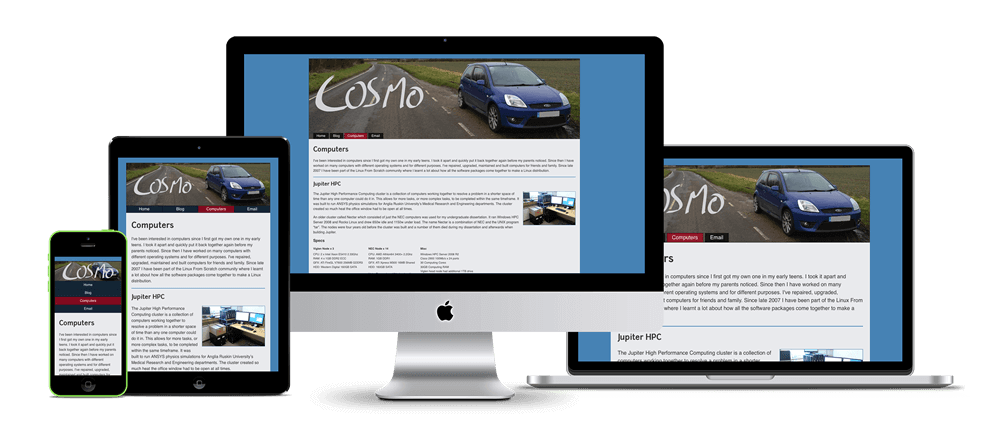
Since I first started learning web design I’ve always aimed to make my website responsive. This latest revision of my website is both responsive and adaptive as you can see in the picture above, the menu adapts to the size of the window when it becomes too small for the responsive layout to cope. I’ve made use of SRCSET in the header so that the best size image is served to the user and use of Flex and Transitions to improve the layout of the menu and lists. A long time I’ve not kept track of who visits my website as I’ve always maintained that the website is made for me and I just allow others to view it. However I’ve become curious to see how many visitors I have and where they come from so I’ve installed Piwik to track my visitors. Depending on how I feel this may be removed at a later date.